
Unicode Text
Unicode Text and Screen Readers: What Actually Gets Read
Learn how Unicode text accessibility affects screen readers, search, and copy-paste text, with practical tests and safer plain-text guidance for profiles.
Contents
Unicode text accessibility matters because styled Unicode — the bold, italic, script and small-caps letters that copy-paste font tools produce — is not formatting. Each styled letter is a separate character with its own name and code point. That is why the style survives a paste into a plain-text field, and it is also why assistive technology treats it as something other than the letter it looks like.
This guide covers what actually happens when a screen reader meets that text, how to test it yourself in a few minutes, and what to do instead when the text has to be read.
Unicode Text Accessibility: The Short Answer
If the text has to be read, searched, or typed back by another person, use plain characters. If it is decoration around text that already says the thing, styled Unicode is usually fine.
The Unicode Standard is direct about this. Of the Mathematical Alphanumeric Symbols block — the source of most bold and italic copy-paste styles — it says the characters are intended for use only in mathematical or technical notation, and are not intended for use in non-technical text. Using them for a bio is using them outside what they were encoded for. That does not make it wrong, but it does explain why software does not treat them as letters.
What Screen Readers Actually Do
There is no single behaviour to quote, and anyone who gives you one is guessing. What assistive-technology guidance reports consistently is that support is inconsistent, and that failures take three shapes.
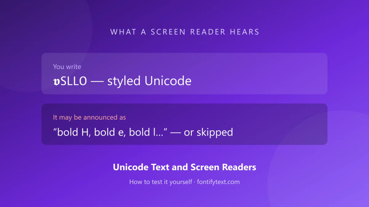
Announcing the character name. A styled letter carries a Unicode name, and some readers read it. 𝐇 is MATHEMATICAL BOLD CAPITAL H, so a word can arrive letter by letter with a style word attached to each one.
Skipping. Some readers pass over characters they have no useful pronunciation for. A whole word can go missing with no indication it was ever there.
Reading it correctly. Some combinations work. Which ones depends on the reader, its version, the voice, and the verbosity setting.
Scope's guidance for businesses describes screen readers saying "bold" or "italic" before or between each letter, making text almost impossible to understand, and notes that some skip words entirely. TPGi — the company behind JAWS — notes that JAWS and NVDA each have their own quirks with special characters, JAWS sometimes announcing them incorrectly and NVDA sometimes skipping them.
The practical consequence is not that it is broken. It is that you cannot predict what a given reader will do, so you cannot rely on the text being heard at all.
Test It Yourself in Five Minutes
You do not have to take any of the above on trust, and testing beats citation. Every major platform ships a screen reader.
iPhone — VoiceOver. Settings → Accessibility → VoiceOver → on. Set the Accessibility Shortcut to VoiceOver first, so a triple-click of the side button turns it off again. Open the bio or caption holding the styled text, then swipe right to move through elements and listen.
Android — TalkBack. Settings → Accessibility → TalkBack → on. Navigate to the text and swipe right through it.
Windows — Narrator. Ctrl + Windows + Enter toggles it. Focus the text, then Caps Lock + Right Arrow to move item by item.
macOS — VoiceOver. Command + F5 toggles it. Control + Option + Right Arrow moves through content.
Run the same word twice — once styled, once plain — and compare. That single comparison tells you more about your own audience's experience than any general claim, including this one.
A second test needs no software at all. Paste the styled text into the platform's own search box and search for it in plain letters. If it does not come back, neither will anyone looking for you.
What Breaks, Ranked by How Much It Matters
| Where the text goes | Risk | Why |
|---|---|---|
| @handle or username | Blocked outright | Instagram, TikTok and Discord restrict handles to standard letters, numbers, underscores and dots. Styled characters are rejected or stripped. |
| Hashtags | High | A styled hashtag is a different hashtag. It will not join the tag everyone else is using. |
| Anything searched | High | Exact-match search compares code points. 𝐇𝐞𝐥𝐥𝐨 and Hello are different strings. |
| Names, prices, dates, links | High | These get read aloud, copied, and typed back. All three break. |
| Body of a bio or caption | Medium | Long styled passages are where per-letter announcement becomes unbearable. |
| One decorative word beside plain text | Low | The plain half carries the meaning. |
| Ornaments and separators | Low, with care | Fine if they carry no meaning. A row of them still gets announced one by one. |
Plain-Text Guidance
Four rules, in order of how much they matter.
1. Never let styled text be the only carrier of meaning. If removing the styling loses information, the styling was doing a job it cannot do reliably. A check mark alone does not say what was completed. Four stars do not say "4 out of 5". Write the meaning in words and let the style decorate it.
2. Keep the searchable half plain. Your name, your handle, your hashtags, and any keyword you want to be found by should be ordinary characters. Style the tagline, not the name.
3. Decorate short, not long. One styled phrase in a bio is a design choice. A fully styled paragraph is a wall a screen reader user has to climb.
4. Give an alternative where you control the markup. On your own site, purely decorative characters can carry aria-hidden="true" so they are skipped rather than spelled out. W3C technique H86 covers text alternatives for ASCII art, emoticons and leetspeak under Success Criterion 1.1.1, Non-Text Content, and the same reasoning applies to decorative character runs. In a social bio you have no markup control, which is exactly why rule 3 matters more there.
Which Styles Are Least Risky
A worked example of that judgement: of the twelve kawaii styles on this site, three leave the letters as letters — the decoration sits around the name, so a reader still announces it and a search still matches it. The other nine swap the letters for look-alikes. Any style set can be sorted this way, and it is worth doing before a name goes into a field you cannot easily change.
Risk here means how likely a reader is to mishandle it, not whether it will display.
- Safest: ordinary letters with ordinary emphasis. Nothing beats them.
- Lower risk: small caps and fullwidth letters. They stay closer to recognisable letter shapes, and fullwidth forms carry compatibility mappings back to plain letters.
- Higher risk: Mathematical Alphanumeric styles — bold, italic, script, double-struck, Fraktur. This is the block Unicode explicitly scopes to technical notation.
- Highest risk: stacked combining marks, as used in Zalgo and glitch styles. Each mark is its own character and a single letter can carry a dozen. This is also the style most likely to break layout.
Whether a style will display on a given app is a different question from how it will be read. The fancy text compatibility guide tests eight styles across six apps for the display half.
Where This Leaves Copy-Paste Fonts
Styled Unicode text is a legitimate tool with a narrow correct use: short, decorative, redundant. It is a poor tool for anything load-bearing.
That is not a reason to avoid it. It is a reason to be deliberate about which half of a line carries the message. Every generator on this site produces characters that behave exactly as described here, including the main font generator, and the styles that read most cleanly are the plainest — small caps most of all. For symbols specifically, the Unicode symbols reference lists what each one is announced as.
Sources
- The Unicode Standard, Chapter 22 — Symbols — scope of the Mathematical Alphanumeric Symbols block
- Mathematical Alphanumeric Symbols, U+1D400–U+1D7FF — the character chart
- Scope for Business — How special characters affect screen readers
- TPGi — Making numbers in web content accessible — JAWS and NVDA behaviour with special characters
- W3C WCAG technique H86 — text alternatives for emojis, emoticons, ASCII art and leetspeak
- W3C WAI — Guidelines to make your social media platform accessible
- RNIB — Guide to accessible social media